.png)

Mobile now accounts for close to 60% of global eCommerce sales and is forecast to generate around 4 trillion dollars in revenue by 2025. Smartphones already drive roughly 70-78% of eCommerce traffic and well over two-thirds of online retail orders, which means most first impressions of your brand now happen on a phone screen.
This guide on how to optimize Shopify stores for mobile walks through the exact UX, speed, and checkout improvements that move the needle on conversions in 2026.
Let’s dive right in!
Why Mobile Optimization Matters for Shopify Stores
Most Shopify stores now see a majority of their traffic coming from mobile, especially if they rely on paid social or influencer marketing campaigns. At the same time, mobile shoppers tend to browse faster, bounce more, and abandon carts at higher rates than desktop users, which creates both a challenge and a massive optimization opportunity for brands willing to go truly mobile-first.
The Rise of Mobile Commerce
Mobile commerce is projected to represent about 59% of all retail eCommerce sales worldwide, equating to roughly 4.0 trillion dollars in sales. Mobile devices already generate around 78% of eCommerce traffic and about 66-68% of retail website orders globally, cementing mobile as the primary shopping channel rather than a secondary touchpoint.
Impact on Conversions and Sales
Despite dominating traffic, mobile still lags behind desktop on conversion rate: benchmarks show desktop conversions around 3.5-3.9% versus roughly 1.8-2.3% on mobile. For Shopify specifically, studies report average eCommerce mobile conversion rates near 1.2% compared with about 1.9% on desktop, highlighting how UI friction, slower connections, and clunky checkouts disproportionately hurt mobile revenue.
Why User Experience Defines Mobile Success
Mobile eCommerce user experience is now a direct revenue lever, even a shift from a 1‑second to a 10‑second mobile page load can increase bounce probability by 123%. Broader UX research shows that 88% of users are less likely to return after a bad experience, and eCommerce bounce rates, already averaging a little over 45%, are consistently higher on mobile than on desktop.
In practice, that means every tap, scroll, and delay on your Shopify store influences whether mobile visitors buy, bounce, or come back later on another device.
What Is Mobile Optimization for Shopify?
Mobile optimization for Shopify is the process of designing, configuring, and continuously improving your store so that it loads fast, looks clean, and works flawlessly on smartphones and tablets, without sacrificing conversions.
It goes beyond “responsive design” to cover performance, navigation, checkout flows, SEO, and accessibility, all tuned specifically for mobile behavior patterns like thumb scrolling and one-handed use.
When done well, mobile optimization narrows the conversion gap between mobile and desktop and ensures that the 70%+ of visitors landing on your store from phones experience a frictionless path from discovery to purchase.
Key Mobile-First Design Concepts
- Design for thumbs: Place primary CTAs where thumbs naturally rest and ensure tap targets are comfortably large.
- Prioritize speed: Strip heavy scripts, compress media, and defer anything non-essential below the fold.
- Content first: Put core product info, price, and primary CTAs above the fold; demote clutter and secondary elements.
- One-task screens: Avoid overcrowding; each screen should focus on a single primary action or decision.
- Minimize typing: Use autofill, address lookups, and wallet payments to reduce form fields and keystrokes.
- Progressive enhancement: Start with a fast, simple baseline that works on any device, then layer richer features where supported.
- Consistent patterns: Use familiar navigation, icons, and UI patterns so users don’t have to relearn your store on mobile.
How to Audit Your Shopify Store’s Mobile Performance
Before you start redesigning anything, pause and audit what’s already happening on mobile. Most stores have a visibility problem. You need clear eCommerce customer data on how they behave, where friction shows up, and which pages silently kill conversions.
A strong audit gives you a baseline. It tells you what to fix first, what to ignore, and where small tweaks can drive the biggest revenue impact.
Evaluating Mobile Traffic and User Behavior
Start inside Shopify Analytics or your connected analytics stack. Look at mobile sessions, bounce rate, conversion rate, and average order value. Don’t just glance at totals. Break performance down by device type, landing page, and traffic source.
Focus on how mobile users actually move through your store. Track where they drop off. If you run paid social campaigns, analyze those landing pages separately because mobile visitors from ads behave differently from organic users.
Pay close attention to session recordings and heatmaps if you have them. Watch how far users scroll. Notice where they hesitate. See whether they struggle to tap buttons or zoom into product images. Real behavior always reveals more than assumptions.
Tools to Test Mobile Friendliness (Lighthouse, PageSpeed Insights, Shopify Analyzer)
Once you understand behavior, shift your focus to performance. Speed and technical health shape every mobile experience, even if your design looks perfect.
Run your key pages through Lighthouse and PageSpeed Insights to check load time, layout shifts, and performance scores. Don’t obsess over chasing a perfect score. Instead, look for clear blockers like oversized images, unused scripts, or slow third-party apps.
You can also use Shopify-focused analyzers to review theme efficiency, app impact, and asset weight. These tools often highlight issues unique to Shopify builds, such as excessive liquid rendering or heavy app embeds that slow mobile loading.
Audit three core pages first: homepage, product page, and checkout. These pages drive most revenue, so improvements here usually create the fastest wins.
Identifying Common Pain Points
Most mobile issues fall into predictable patterns. Heavy banners push important content below the fold. Sticky elements cover key buttons. Pop-ups interrupt navigation. Slow image loading breaks the flow right when users want to explore products.
Look for navigation friction as well. Long menus, tiny tap targets, or unclear filters make browsing feel exhausting on a small screen. Even small details, like inconsistent spacing or delayed animations, can make your store feel slower than it actually is.
Also review checkout friction. Extra form fields, forced account creation, and confusing payment options often cause the biggest drop-offs. If users need to pinch, zoom, or retype information, you’re losing conversions.
Essential Elements of a Mobile-Optimized Shopify Store
1. Use a Responsive Shopify Theme
Start with a theme built for mobile behavior, not just desktop layouts that shrink to fit smaller screens. Choose a responsive Shopify theme that adapts spacing, typography, and image scaling automatically. Test product pages, collection grids, and pop-ups on real devices to make sure nothing breaks the flow.
2. Simplify Site Navigation (Menus, Sticky Bars, Search)
Mobile users move fast. Keep menus short, prioritize top categories, and add a sticky header or bottom bar so shoppers can access search and cart anytime. Smart search with autocomplete helps users skip browsing and jump straight to products.
3. Optimize Images and Media for Faster Load Times
Compress images, use modern formats, and avoid autoplay videos above the fold. Fast-loading visuals improve perceived speed and keep users engaged. Focus on clarity over heavy design effects.
4. Streamline the Checkout Process
There are so many studies out there that indicate reducing the number of steps it takes to complete the purchase does wonders. Enable guest checkout, autofill, and wallet payments. Every extra field slows users down, so keep forms minimal and mobile-friendly.
5. Ensure Cross-Device Compatibility
Different devices and browsers behave differently. Test your store across Android, iOS, tablets, and different browsers. Consistency builds trust and prevents unexpected layout issues. If someone visited you on their mobile and goes to buy on a tablet, they should have a consistent experience.
6. Implement Accessibility Best Practices
Use readable font sizes, strong contrast, and large tap targets. Clear labels and logical navigation help all users complete purchases faster. More on it, in the upcoming sections.
Use Shopify Apps and Third-Party Tools
1. Apps to Enhance Mobile Functionality
If you truly target mobile users, your brand needs to live on their home screen, not just inside a browser tab. A mobile-optimized website helps, but a native app multiplies the results. In most cases, whatever performance gains you see on mobile web can improve up to 5 times inside a well-built mobile app because of faster load speeds, push notifications, and smoother navigation.
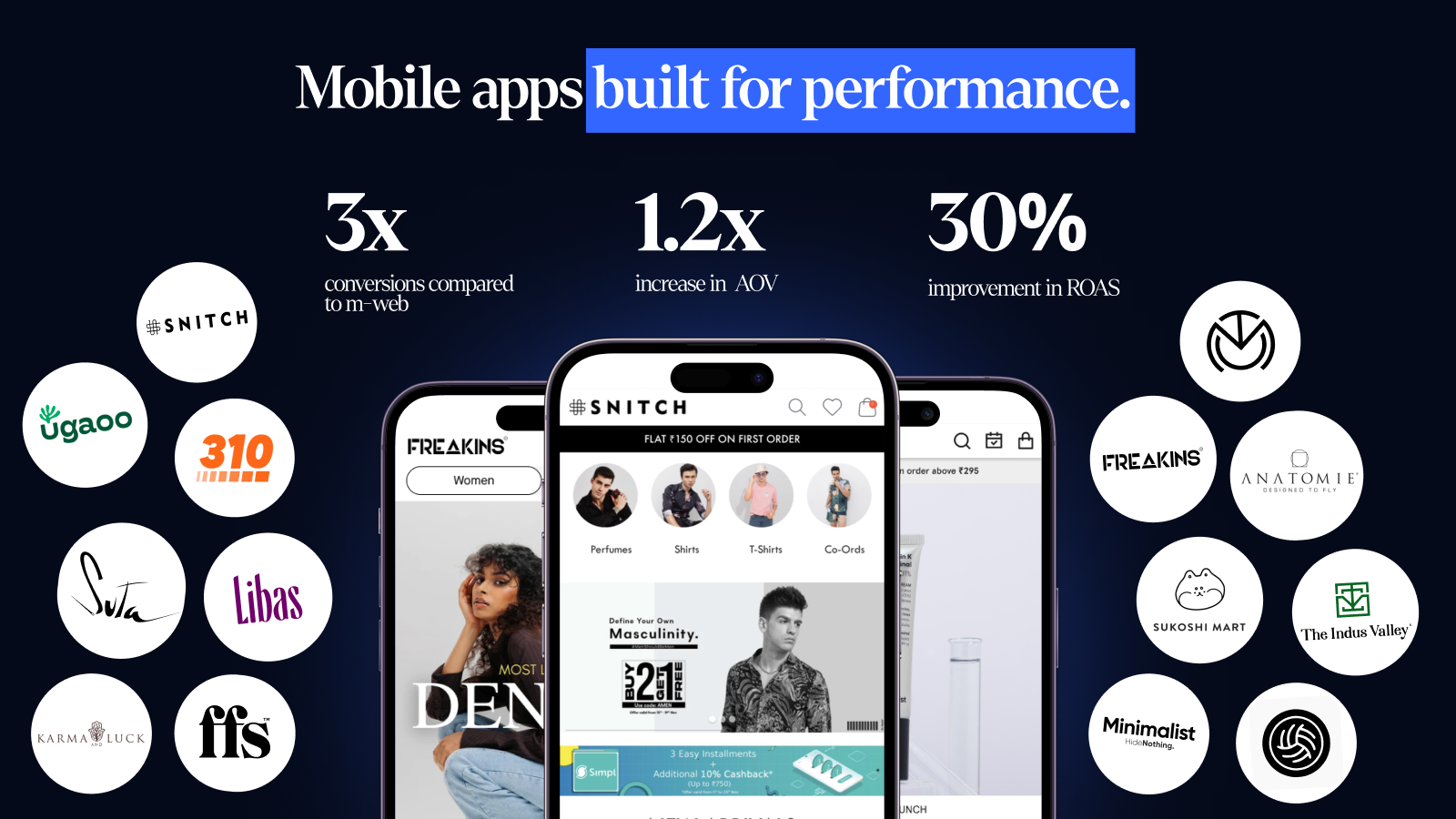
Fortunately, Shopify makes this transition easier than ever. Shopify mobile app builders like Appbrew integrate directly with your store and let you build fully native iOS and Android apps without hiring a full tech team.
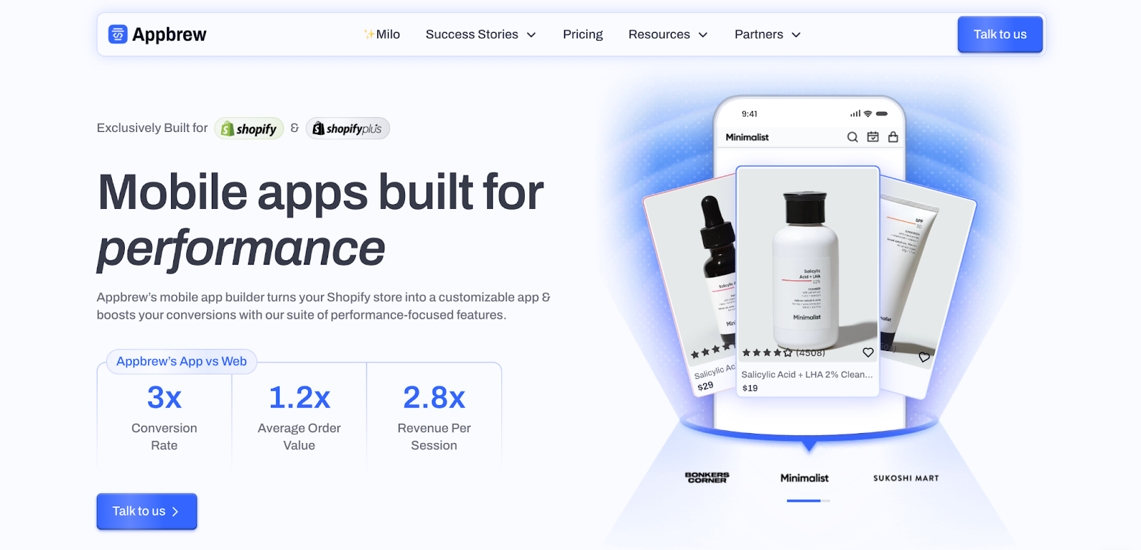
You can sync collections, product data, and customer accounts automatically and launch your mobile app in as little as a week. Beyond speed, you unlock higher retention through push alerts, personalized feeds, app-exclusive discounts, and a checkout flow designed purely for thumbs.
[[cta]]
2. Mobile-Only Features (1-Click Checkout, Tap-to-Call, etc.)
Mobile shoppers expect instant actions. Add one-click checkout options, wallet payments, tap-to-call support, and click-to-chat buttons to remove friction. Sticky add-to-cart bars and swipeable product galleries also help users move faster without extra scrolling. Every tap should push users closer to purchase.
3. Integrating Mobile Analytics Tools
Data drives smart optimization. Connect mobile analytics tools to track in-app events, scroll depth, and conversion funnels across devices. Monitor push notification performance, retention metrics, and session behavior to understand how mobile users differ from desktop visitors. When you combine analytics with testing, you stop guessing and start improving what actually moves revenue.
Enhancing Mobile User Experience (UX/UI)
Once your store loads fast and functions well, the next step is refining how it feels in a user’s hand. Following eCommerce mobile UX best practices removes hesitation. It guides shoppers from browsing to buying without making them think twice.
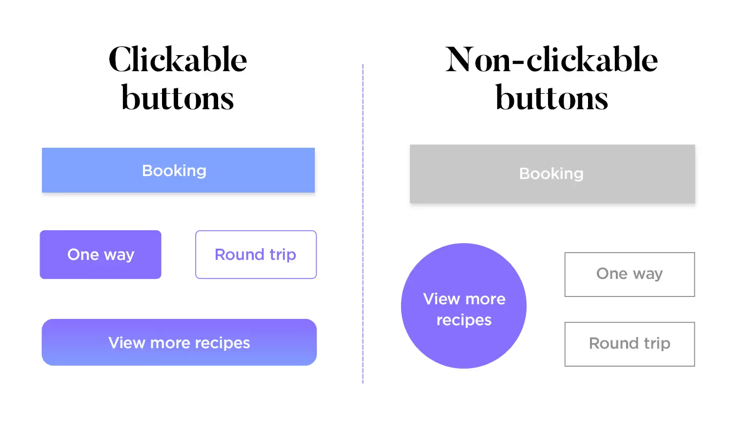
1. Use Touch-Friendly Buttons and CTAs
Design every button for thumbs, not cursors. Keep tap targets large enough to prevent accidental clicks, and place primary CTAs where users naturally rest their fingers. Sticky add-to-cart bars, clear contrast colors, and short action-driven labels help users move forward quickly. Avoid crowding multiple buttons together; give each action enough breathing room.
2. Maintain Readable Fonts and Text Sizes
Mobile users scan fast, so text must stay clear at a glance. Use legible font sizes, balanced line spacing, and strong contrast against the background. Keep product titles concise and break longer descriptions into short paragraphs or bullet points. If users need to zoom in to read, you’ve already lost momentum.
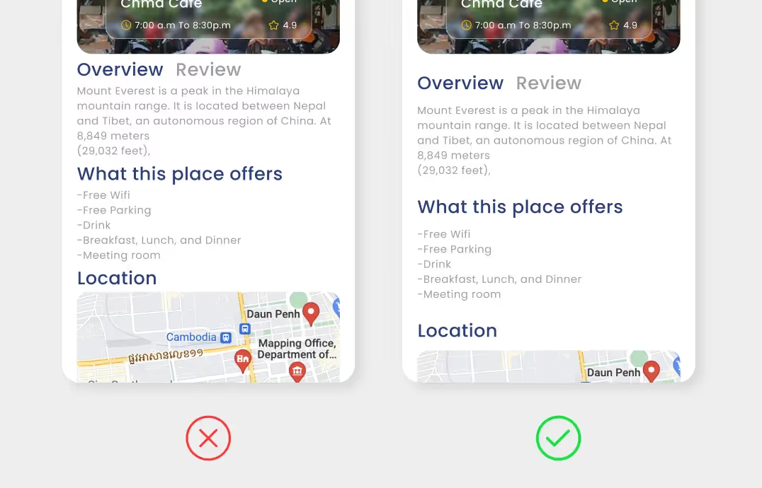
3. Prioritize Visual Hierarchy and Scannable Layouts
Guide attention through structure, not decoration. Place product images, price, ratings, and CTAs above the fold. Use spacing, bold headings, and subtle dividers to separate sections. A clean hierarchy helps shoppers understand what matters first and reduces cognitive load. Think of each screen as a quick decision point rather than a long scrolling experience.
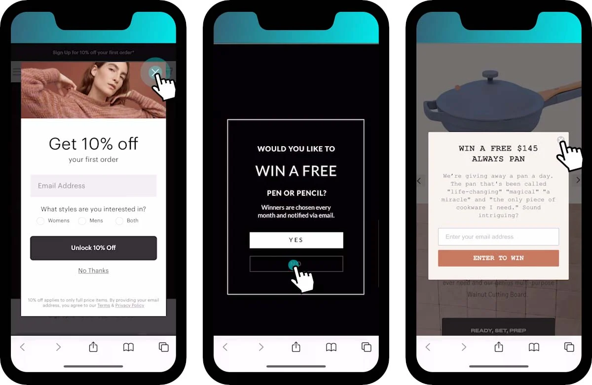
4. Keep Pop-Ups Minimal and Mobile-Friendly
Pop-ups can drive conversions, but aggressive overlays often push users away. Trigger them at natural pauses instead of immediately on page load. Use slide-ins or small banners that don’t block the entire screen. Always include an easy-to-tap close icon. The goal is to assist the shopper, not interrupt their flow.
Boosting Your Shopify Store Speed on Mobile
Mobile shoppers rarely wait. Even small delays break momentum and push users back to search results or social feeds. Improving speed doesn’t always require a redesign, it often comes down to removing friction behind the scenes.
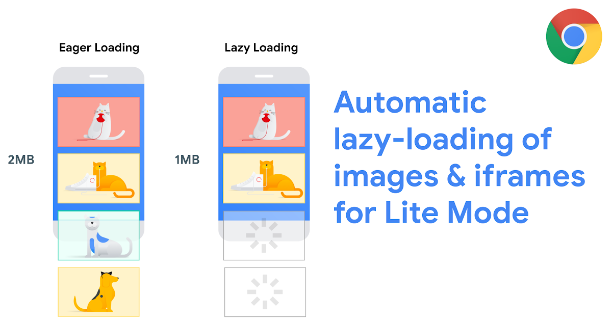
1. Compress and Lazy Load Media
Large images and heavy videos slow mobile performance more than anything else. Compress product photos without sacrificing clarity and switch to modern formats where possible. Use lazy loading so images appear only when users scroll to them instead of loading everything at once. Prioritize above-the-fold visuals first and defer the rest to keep initial load times fast.
2. Minimize Unnecessary Scripts and Apps
Every Shopify app adds extra code, and too many scripts can quietly drag down performance. Audit installed apps regularly and remove tools that no longer add value. Replace multiple single-purpose apps with one consolidated solution whenever possible. Also review third-party trackers, chat widgets, and animation libraries, if they don’t directly impact conversions, consider removing or delaying them.
3. Leverage Shopify’s Built-In Speed Optimization Tools
Shopify already provides several performance advantages if you use them correctly. Choose lightweight themes, rely on Shopify’s global CDN for faster asset delivery, and monitor performance insights inside Shopify admin. Optimize Liquid code, reduce render-blocking elements, and keep theme updates clean to prevent technical debt. Small backend improvements often translate into noticeable speed gains on mobile, helping pages load smoothly even on slower networks.
Mobile ASO and SEO Best Practices for Shopify
Apart from the design and speed, you also need stronger visibility. A mobile-first SEO and ASO strategy ensures your store, and your app, if you have one, shows up when high-intent shoppers search.
1. Optimize Meta Tags and Alt Text for Mobile
Write short, clear title tags and meta descriptions that read well on smaller screens. Front-load important keywords because mobile SERPs often truncate long text. Add descriptive alt text to every product image so search engines understand context while improving accessibility. Focus on clarity over keyword stuffing.
2. Use Structured Data and Core Web Vitals
Structured data helps search engines display rich results like ratings, pricing, and availability directly in mobile search. Implement product schema, review markup, and breadcrumb structure wherever possible. At the same time, monitor Core Web Vitals such as Largest Contentful Paint and Cumulative Layout Shift. Stable layouts and fast load times improve rankings and reduce bounce rates.
3. Create Mobile-First Content Layouts
Design content for scanning, not reading long blocks. Use short paragraphs, bold subheadings, and quick visual breaks. Place key product information, FAQs, and CTAs near the top of the screen so users don’t need to scroll endlessly. Mobile-first formatting also improves dwell time, which supports stronger SEO signals.
4. Optimize App Store Keywords and Listings (ASO)
If you launch a mobile app, treat the app store listing like a landing page. You must follow ASO best practices for eCommerce for both iOS and Android specific platforms. Use keyword-rich titles, concise descriptions, and benefit-driven screenshots. Highlight features that solve real problems, such as faster checkout or exclusive app-only deals, to improve discoverability.
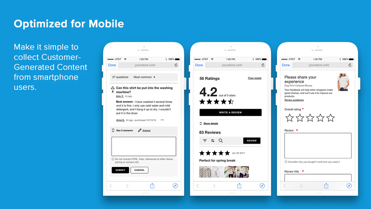
5. Encourage Ratings, Reviews, and Update Momentum
App store algorithms reward engagement. Prompt satisfied users to leave reviews and maintain a steady update cycle with performance improvements or new features. Positive ratings increase trust, improve ranking, and drive more organic installs over time.
Testing, Personalization, and Continuous Optimization
Mobile optimization never truly ends. User behavior changes fast, devices evolve, and even small layout tweaks can shift conversion rates. The goal is to treat your Shopify store like a living product, test often, learn quickly, and refine what works.
Conduct A/B Experiments for Mobile Layouts
Test one change at a time so you know what actually drives results. Experiment with sticky add-to-cart bars, button placements, image sizes, or simplified product descriptions. Focus on high-impact pages like the homepage, product page, and checkout. Measure outcomes using clear metrics such as conversion rate, scroll depth, and add-to-cart actions. Even small UI adjustments can create meaningful lifts when scaled across mobile traffic.
Analyze Heatmaps and User Feedback
Data tells you what happens, but behavior tools show you why it happens. Use heatmaps and session recordings to spot hesitation points, missed taps, or confusing navigation. Watch how users scroll and where they abandon the journey. Pair this with direct feedback through surveys or support chats. When real users highlight friction, treat it as a roadmap for improvement rather than criticism.
Stay Updated with Shopify Mobile Updates
Shopify constantly rolls out performance upgrades, checkout enhancements, and new mobile features. Keep your theme updated, review app compatibility, and monitor any changes to checkout extensibility or payment flows. Regular audits help you catch issues early before they affect conversions. Schedule monthly reviews to evaluate speed, UX performance, and analytics trends. Continuous optimization keeps your store aligned with evolving mobile expectations and ensures that improvements compound over time instead of fading after one redesign.
Conclusion
Mobile is no longer a secondary channel. It shapes how customers discover, browse, and buy from your Shopify store. When you keep mobile at the center of your strategy, every improvement, faster speed, cleaner UX, smoother checkout, compounds into stronger conversions over time.
The brands winning in 2026 don’t treat optimization as a one-time project. They test continuously, refine layouts, and adapt to changing user behavior. Small upgrades today build long-term revenue tomorrow.
If your analytics show a steady influx of mobile traffic, which most Shopify stores already experience, you simply can’t rely on mobile web alone. A native app creates a faster, more immersive shopping experience that drives higher retention and repeat purchases.
Platforms like Appbrew make this transition simple by turning your existing Shopify store into a fully native mobile app without heavy development effort.
Ready to improve your mobile strategy? Book a demo today and see how you can launch your own high-converting Shopify mobile app.


